Brief Introduction
 Updated 4 months ago
by
Stephanie Krenz
Updated 4 months ago
by
Stephanie Krenz
The AI Analyst uses generative AI to explain analysis results from dab Nexus in text form and can be used for subject-specific follow-up conversations.
The following Power BI dashboard displays the selected analysis in the top-left heading and the corresponding result in the bottom-left corner. The bar chart visualizes the results of the analysis, with the months displayed on the x-axis. The y-axis shows either the number or the volume of findings, depending on whether "Count" or "Volume" was selected (see "Count" and "Volume" in figure 1). The Root-Cause Analysis groups the results, names the clusters found (see "Overview" table in figure 1, top left) and colors the bar chart accordingly. The AI analyst then provides a proactive explanation of the bar chart and the analysis results (see first message in the chat in figure 1). Additionally, the AI analyst responds to analysis- or subject-specific queries via the chat (see "Follow-Up Conversation" in figure 1).
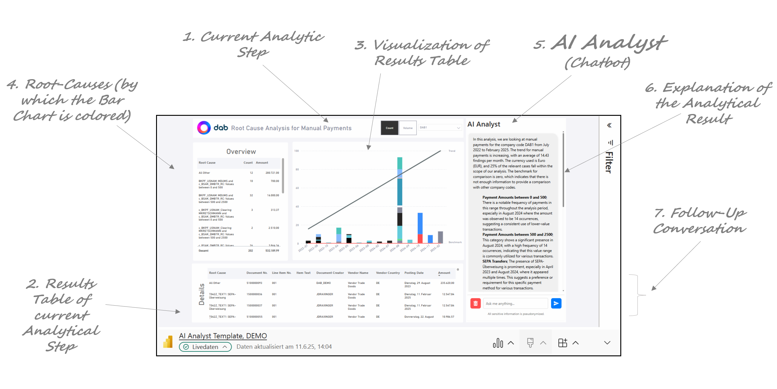
Figure 1: Root-Cause Analysis and AI Analyst
To explain analysis results or to answer further queries, the background knowledge provided is used, such as various documentations on our analysis portfolio (see "Background Knowledge" in figure 2). An LLM uses this information to generate an answer to a user's query. Both the LLM and the background knowledge are hosted and stored in Microsoft Azure.
Initially, when the AI Analyst is used, a prompt is automatically sent to Azure to generate an explanation. This prompt contains the following information for the analysis shown (see "Initial Prompt" in figure 2):
- Type of the Analysis
- Explanations for the columns "Date", "Root-Cause" and "Count" or "Amount" (see table in "Initial Prompt")
- KPIs and parameters:
- Company code from the current view in the dashboard (see figure 1)
- Trend from the bar chart from the current view in the dashboard (see figure 1)
- Average per month from the bar chart of the current view in the dashboard (see figure 1)
- Reporting Currency of the selected analysis from the current view in the dashboard (see figure 1)
- Ratio of the number or volume of findings compared to the base quantity/volume (example for analysis that filters manual payments to suppliers ("AP_ManPayments"): Number or volume of manual payments found in relation to the number or volume of all payments checked. This ratio is calculated per company code.
- Benchmark: If the analysis is carried out for several company codes, the benchmark is the average number or volume of findings per month across all company codes, excluding the one shown
- Results table of the analysis shown aggregated to the Root Causes, with the following columns:
- Date
- Root_Cause
- Count or Amount
If the user sends further requests via the chat, the chat history and the latest request itself are transferred to Azure. See "Follow-Up Prompt" in figure 2.
No further customer data is transferred at any time. The data transfer is limited to the "Initial Prompt" and the current chat history. All user, supplier and customer names are transferred to Azure in pseudonymized form.
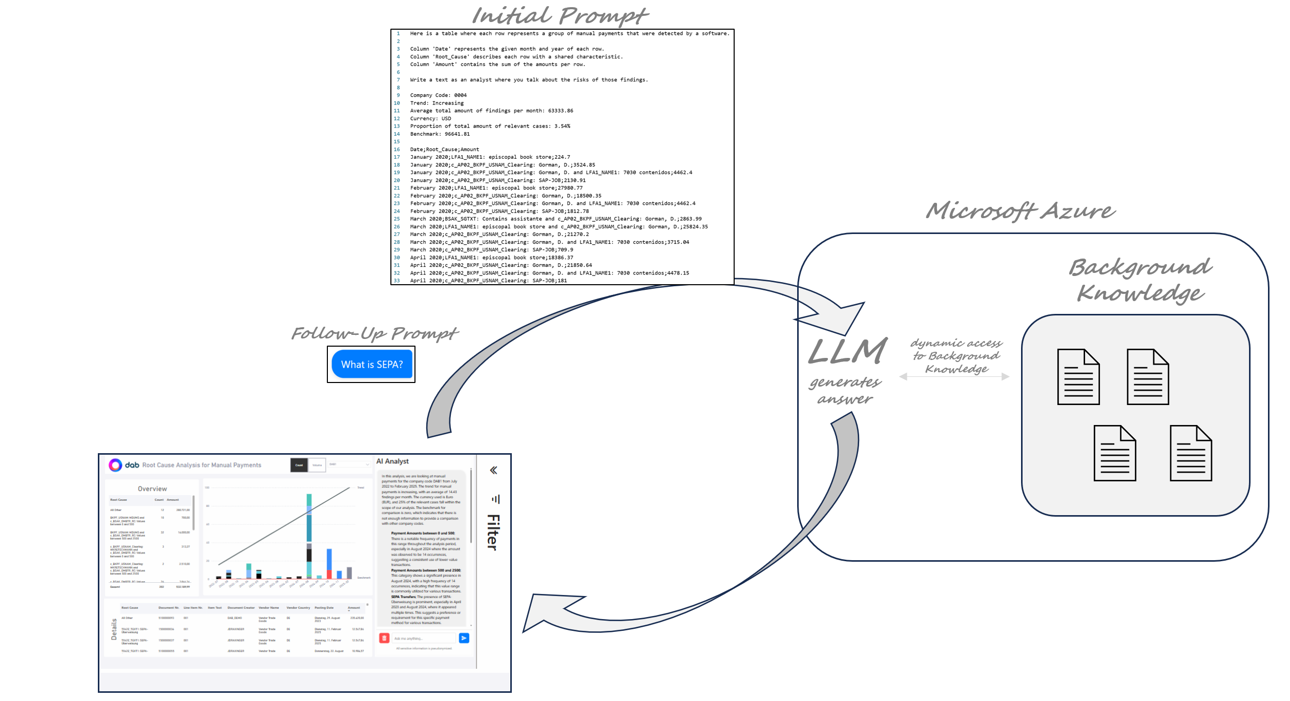
Figure 2: Grounding of the AI Analyst with Background Knowledge
As shown in figure 3, the AI Analyst is an Add-On for the analyses of dab Nexus. The workflow shows our complete end-to-end solution: from extraction and standardized analyses to automated results preparation with AI and the step back to SAP.

Figure 3: Workflow with the AI Analyst